Hi there!
I'm Eric Yang
Seeking Design & Design-Engineer Roles
About
I am a cross-functional designer that can code his own mockup prototypes so your team can focus on business logic.
My creative process is fundamentally rooted in the tool-agnostic skillset of concept art combined with the user-centric methodologies of UX.
I draw on my academic background in HCI and cognitive psychology to inform how I employ colour, form, contrast, & motion into my work.
Skip to a section
Digital Art
Keyshot, zBrush, Photoshop, & Clip Studio Paint
Digital Concept Art Pieces
Mockup to Code
Figma Desktop Screens
Trichord Editor Web App Initial Concepts
NextJS with PrimeReact UI, NextAuth, & MongoDB
Live Interactive Components
Inline SVG & Event Listeners
Rigging Skeuomorphic Interactivity
UX / UI Design
Figma Mobile Screens
Flikshop App Modernization & Rebranding
Figma Desktop Screens
CIAAN Security Cybersecurity Automation Platform
Digital Art
Digital Art
The fundamentals of my visual design skills I use for interfaces has been developed through my previous graphic design and digital concept art work — especially how I handle color, form, and contrast.
Experiencing the ridiculous learning-curve of using zBrush and KeyShot to create 3D concept art as a complete beginner has reinforced my confidence in diving head-first into new workflows to execute on creative vision.


Blending Render Passes
Blending Various KeyShot Render Passes using photoshop
Figma to Code
Figma to CODE
My coding skillset is focused on design-implementation and seeing what's possible with SVG, CSS, and web animation techniques.
My Trichord Editor project is part of my drive to prove in working code the unique interaction patterns and visuals of my designs.
Icon SVGs were styled in Figma then ran through SVGR Playground for optimization.
Initial Figma Concepts
The first draft of the Trichord Editor.
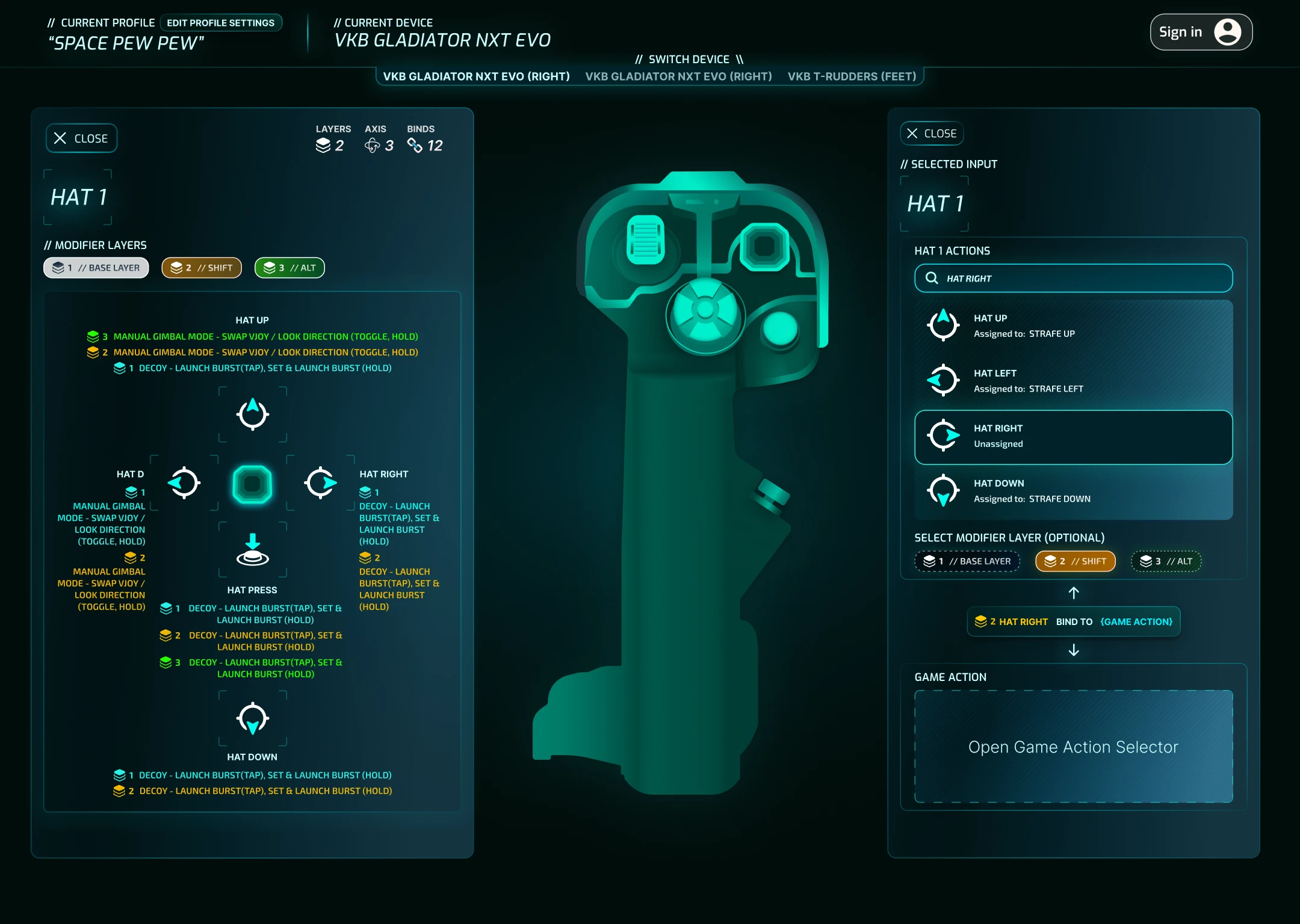
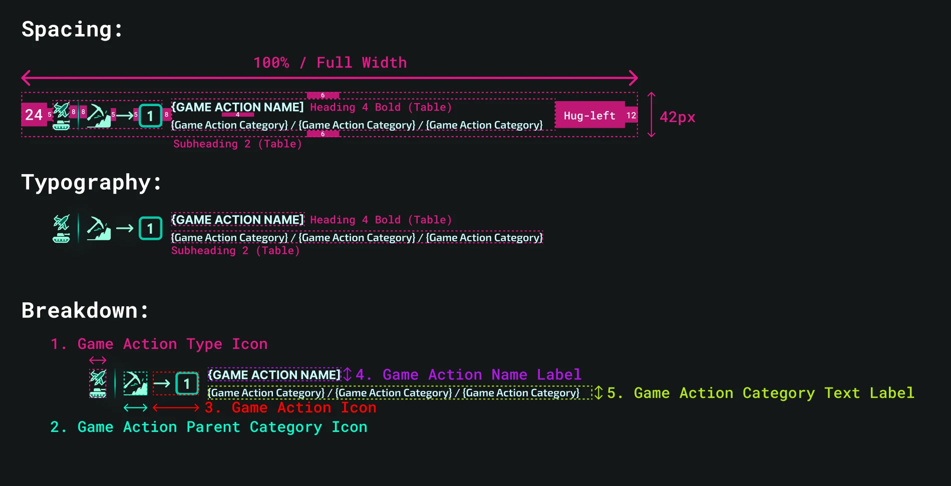
Main Editor Screen
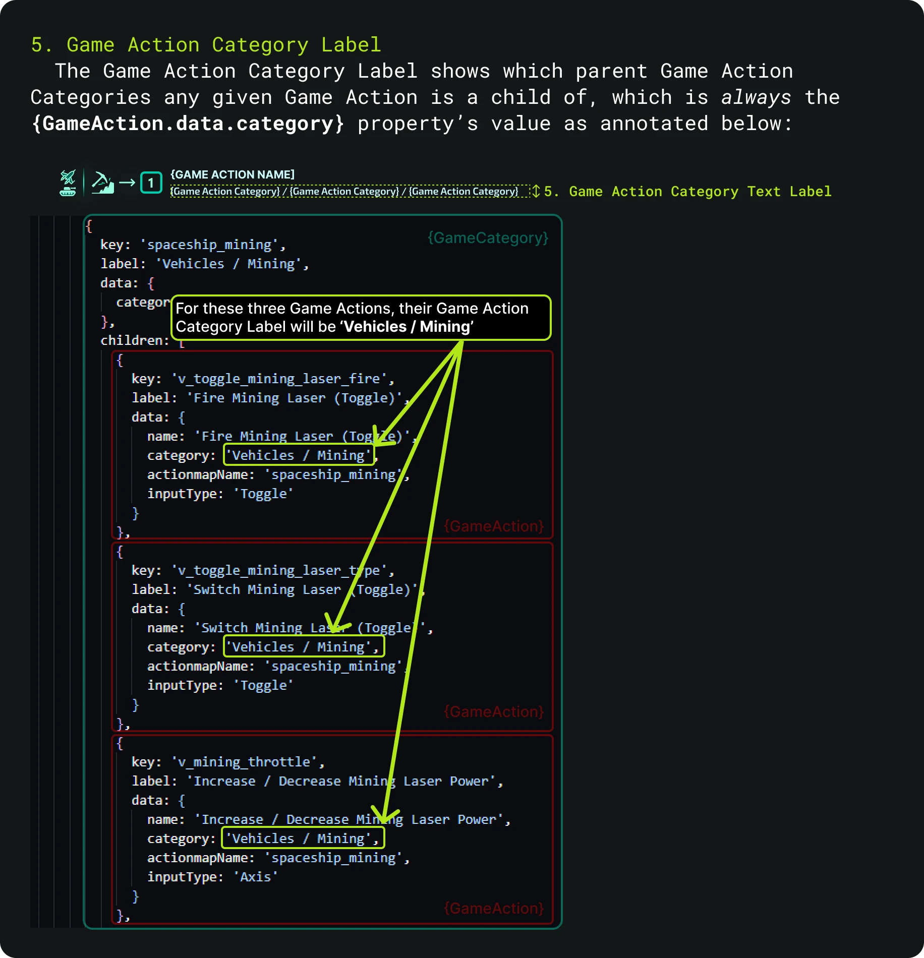
This is where users view and customize their devices' input bindings. The leftmost panel shows the saved keybinds for any given device input/button/axis selected by the user. While the rightmost panel shows all available inputs of the selected device.
Main Editor Interface
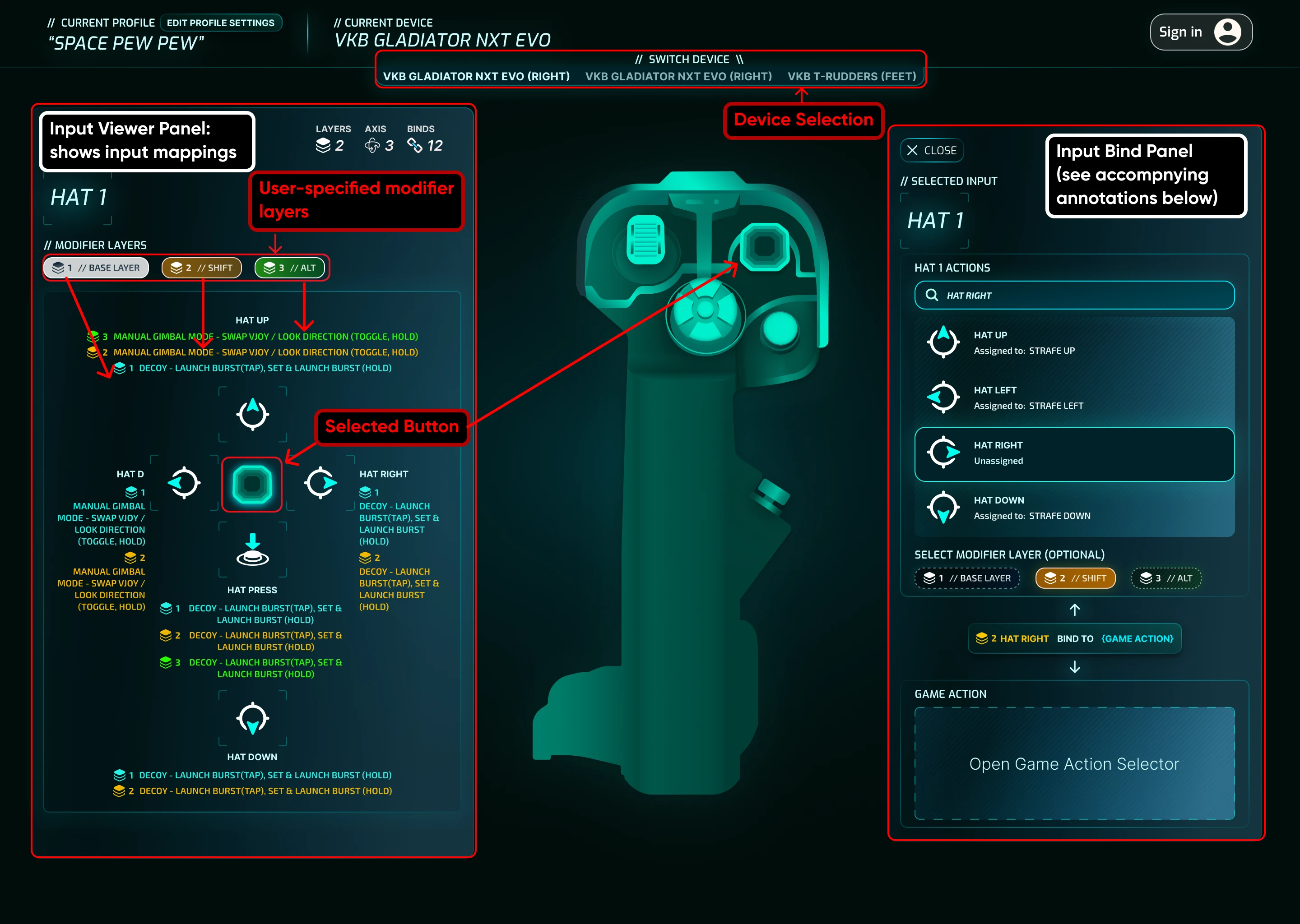
Main Editor Interface (Annotated)
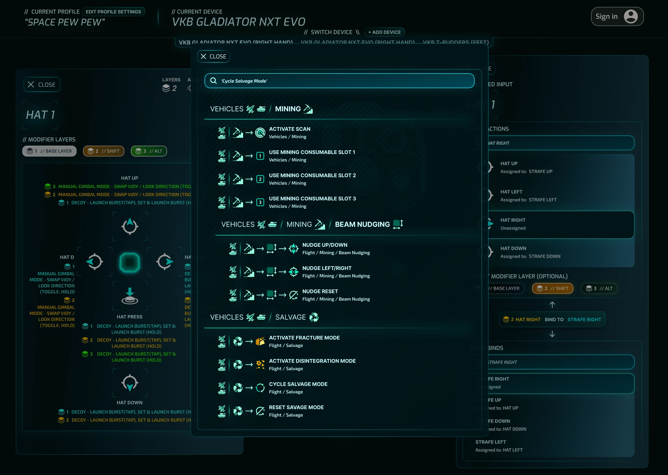
Keybind Selection Panel
This panel features a searchable database of all in-game keybinds. Every keybind (500+) is accompanied with unique iconography that painstakingly created over many weeks.
Main Editor Interface
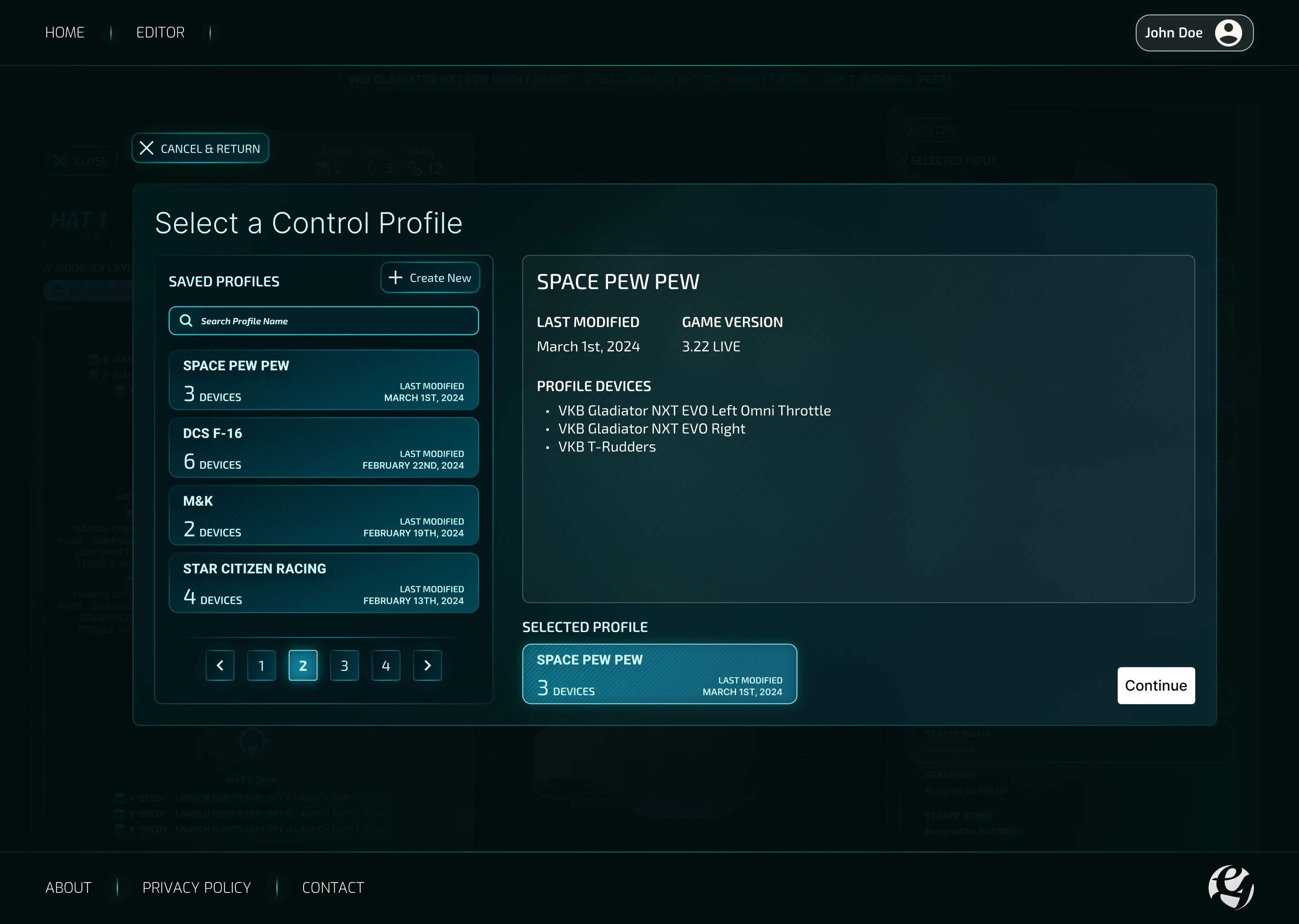
Profile Selection Screen
This panel allows users to select and create profiles containing their devices with their respective saved keybinds. Selecting a profile will take them to the main editor screen for keybind customization.
Profile Selection Screen
</>
Coded Components
The first draft of the Trichord Editor.
Interactive Device SVGs
To enable intuitiveskeumorphic button/device-input selection, users can simply visually click on any given device input instead of referring to clunky dropdowns with semantically meangingless input labels such as "input 28".
VKB Gladiator EVO Flightstick
VKB T-Rudder Pedals
Device Input Panel
The device input panelshows all available button and axis inputs of a selected device. Clicking on an input will open the keybind panel for users to bind an in-game keybind to the selected input.
Code Markup Examples
CSS/Tailwind Markup
JSON Markup for Runtime Iconography Generation
UX / UI
I can work around frontend UI Library & Design Systems, markup front-end contingincies such as flexbox & media-query breakpoints, or create proof-of-concepts and prototypes in working code.
I aim to be crossfunctional as possible from talking technical feasibility with developers to seeing how my design assets could serve as marketing collateral.
CIAAN Security
Cybersecurity Automation Platform
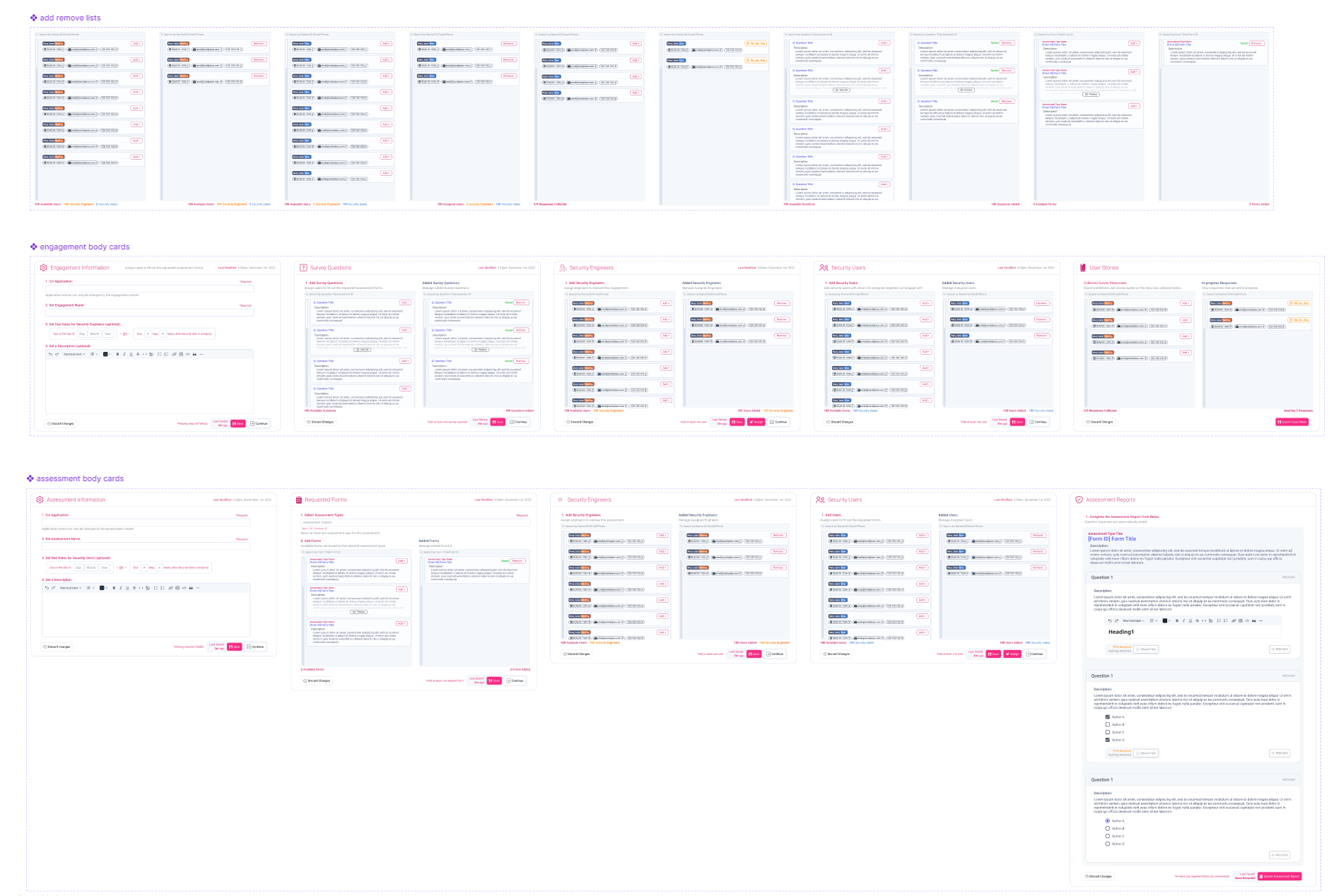
Security Assessments
Designing CIAAN Security's SCAS (Security Controls & Assessment System) cybersecurity assessment workflows through:
1. Improving visual parsing through card-based interaction patterns
2. Reducing mental load and anxiety by exposing and verbalizing various system status states
3. Elevating system aesthetics beyond the basic Bootstrap theme to make it more pleasant to use and marketable to T-Mobile
Before
After
Spreadsheet View
To scalably manage dozens of security engagements & assessments, a spreadsheet overview page was designed for the Security Staff. Custom filtering was also added to the prototype based on system and user requirements.
Spreadsheet Filtering Demo
Component Library
All commonly reused interface elements were turned to prototypes and their respective varients to allow any changes to consistently progogate throughout all screens.
Read Case Study
Project Length
4 Months
Role
Sole UX/UI Designer
Project Type
Workflow Mockups
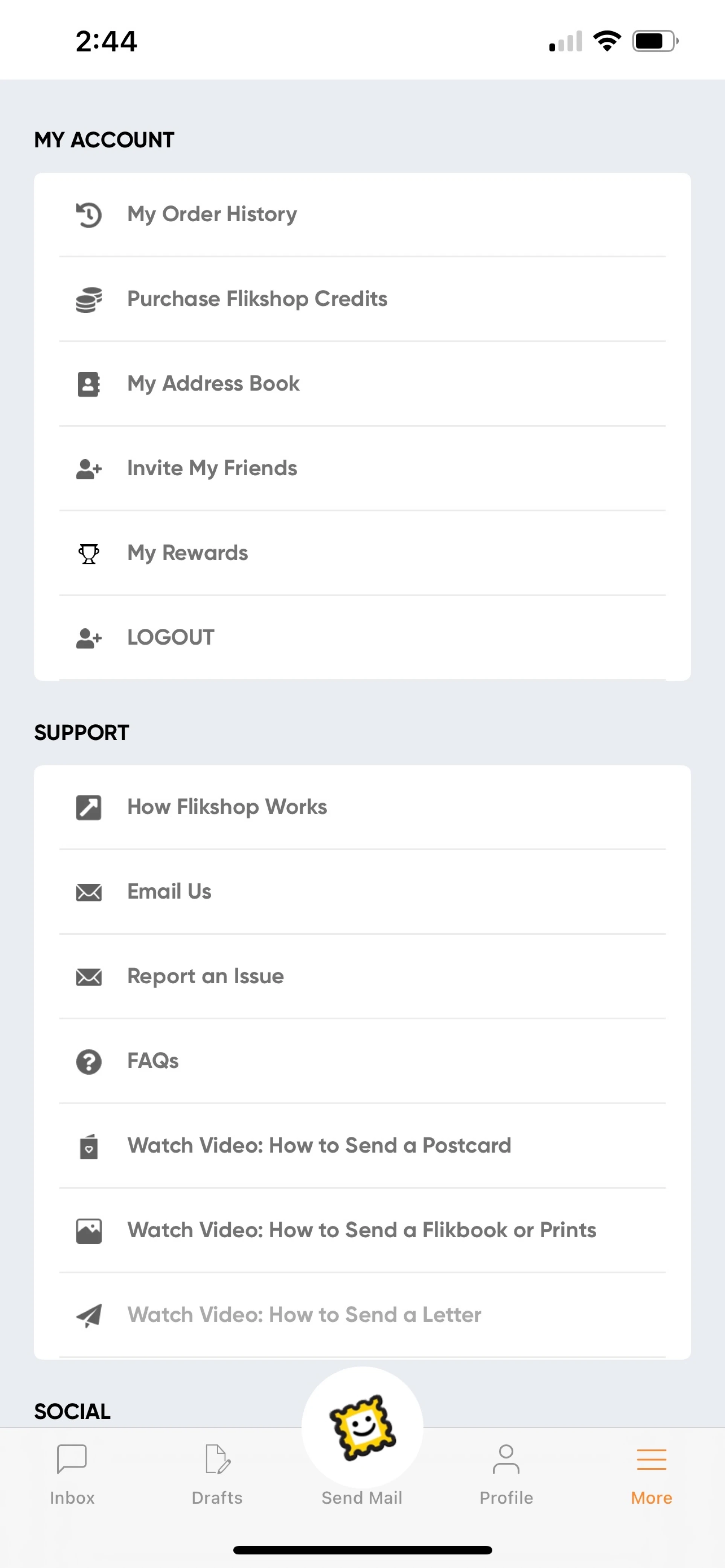
App Modernization & Rebrand
UI & Branding Refresh
Elevating the Flikshop app's visual styling and branding beyond the previous corporate minimalist aesthetic.
Before: Flat Minimalism
After: Brand-colors w/ Gradients
Integrating Flikshop Platforms
Integrating additional Flikshop product platforms into the existing user experience through distinct color pallette identities and interaction patterns such as hotswap menus.
Platform Hotswap Menu Component
Platform Hotswap Menu Demo
Guided onboarding Tutorials
Onboarding users to newly integrated platform features such as the hotswap menu using pop-up hint tutorials.
Guided Onboarding Demo
Read Case Study
Project Length
8 Months
Role
UX Designer
Project Type
App Design & Modernization
That's all for now!
That's all for now!
👋